Albums of the Year

I’m a huge fan of music – listening to it, not making it. With the exception of An Artist I Admire post featuring Zoe Keating, music has not enjoyed much of the spotlight here at exploring-art.com. Primarily this is because exploring-art is about investigating my less developed interests in the arts. That said, I feel the need to highlight my favourite albums of 2011.

Album of the Year: Kiss Each Other Clean

I am an Iron & Wine fan, but to me Our Endless Numbered Days stood out as the epoch of his achievement. Kiss Each Other Clean is at least on par with Our Endless Numbered Days, and it’s musically very different. It is a beautiful thing, dramatically different yet aesthetically alike. You’ll be left wondering why isn’t there more? Left wishing there were more, and yet you’ll be pleased to play it again.

Canadian Album of the Year: Land & Sea

I’ve been a long time fan of Sarah’s; I learnt of her in the early 2000’s living in Toronto, and I haven’t stopped buying her albums. With Land & Sea, an ambitious double album, Sarah shows off her spectacular vocals, as well as her meticulous compositions and arrangements. This album is one of my favourites, but why is it not at the top of the heap? Since it’s not the performance or the production, I suspect that it may be some of the lyrics that hold it back from perfection. But let’s not forget that Sarah is seen here towering over Feist for Canadian album of the year- No small achievement! For lovers of instrumental collections, I’d highly recommend Sarah Slean’s String Quartet Part II, it’s wonderful.

Underrated Album of the Year: Ceremonials

With headlines like, “More is Less”, I feel Ceremonials was unfairly treated in the press. I must admit after the single Shake it Out, the rest of the album wasn’t what I was expecting… but it grew on me, and now it’s a regular on the home stereo as well as my iPhone. With this album Florence and the Machine progress towards a sound that is more choir inspired and less modern bass line and alternative driven. The resulting sound is slightly reminiscent of the 80s, and more specifically, the Eurythmics; however, the music maintains its own identity, and more crucially, it is an evocative and enjoyable album.

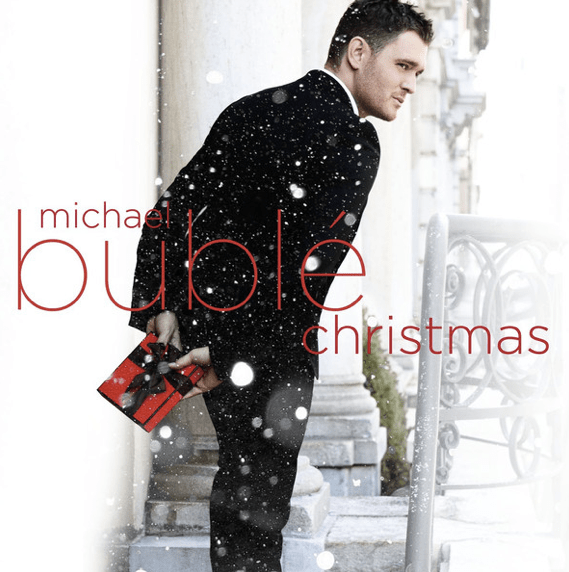
Christmas Album of the year: Michael Buble Christmas

One of my wife’s nephews gets credit for this recommendation. He is a wonderful singer in his own right and performs in a number of High School ensembles. I’m not a Buble fan, so I was a bit of a skeptic. As it turns out Michael Buble Christmas is a fun, upbeat, and musical album which carries the possibility of  winning over even the biggest scrooge. Merry Christmas!

Creative Challenge: Logo / Graphic Design

Creative Challenge Number 3

This week’s creative challenge, design a logo or graphic for yourself, your neighbour, your business, your dream business, your baseball team, your secret super hero identity.

Here’s mine for Exploring-Art.com:

In addition to the weekly participation call; to create one yourself and post it online to share with us, I will also review the process I went through to create this graphic, utilizing the creative process outlined in Monday’s post.

Phase 1: Initial Idea
My super-concious returned the idea for a logo or graphic, in response to two loosely coupled asynchronous queries… A topic for a weekly challenge, and a graphic for T-shirts and business cards for shameless self promotion…

Once I had decided to design a graphic, where was I to start? Again my super-concious answered. Remember those coloured bars on old, analog, CRT televisions when there was no signal? That was the seed from which my graphic emerged.

Phase 2: Discernment
I googled for images of “no TV signal” to refresh my memory of what they looked like… I counted the number of coloured bars and sketched a layout in my unlined notebook. I had originally imagined the pictures on top of the colour bars but quickly realized that it would be better underneath. I was originally thinking there would be space for the URL as well as the name but quickly saw that would be far too cluttered.

I also wanted to soften the colours from the no signal graphics, going back to my notion of creatio collegiate, I wanted the colours to be more welcoming than abrasive.

I recognized the need for block letters to make the .com name readable, striking and similar to the current theme used on the WordPress site.

A one man search through recent photos for photos that would blend into the coloured bar above them…

Can you feel it? The fabulously fantastic frenzy of being in the flow of the creative process? If you don’t do this regularly you really ought to try it… If a graphic is too intimidating try the pen name, or poetic snapshot challenge. Look for a new Creative Challenge every week a exploring-art.com.

Phase 3: Refinement
I had to fix the white black space. I tried a dozen different fonts, switched photos in and out… reiterate, iterate, reiterate.

Phase 4: Completion
I got that warm happy feeling, and I was done.

Graphical Me

Graphical Me

Graphical Me

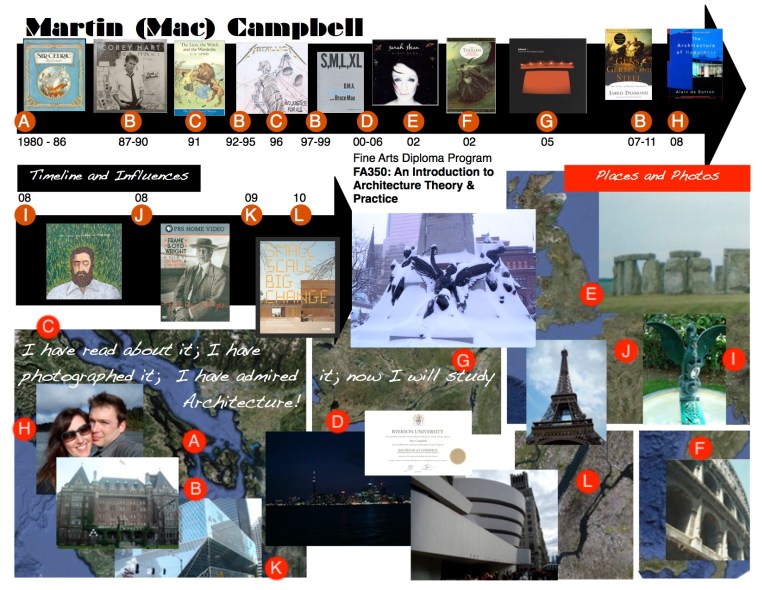
First let me say I loved FA350: An Introduction to Architecture: Theory & Practice at UVic. I took it this July (2011) in condensed format… Monday to Friday, 4:30-6:30, for 3 weeks + 2 days… it was awesome!

The first assignment? On a 8.5 * 11 piece of paper design a graphic to represent and introduce yourself to your classmates, and explain why you are interested in Architecture.

Being process minded and cognisant that personality is at least partially an emergent characteristic I designed this.